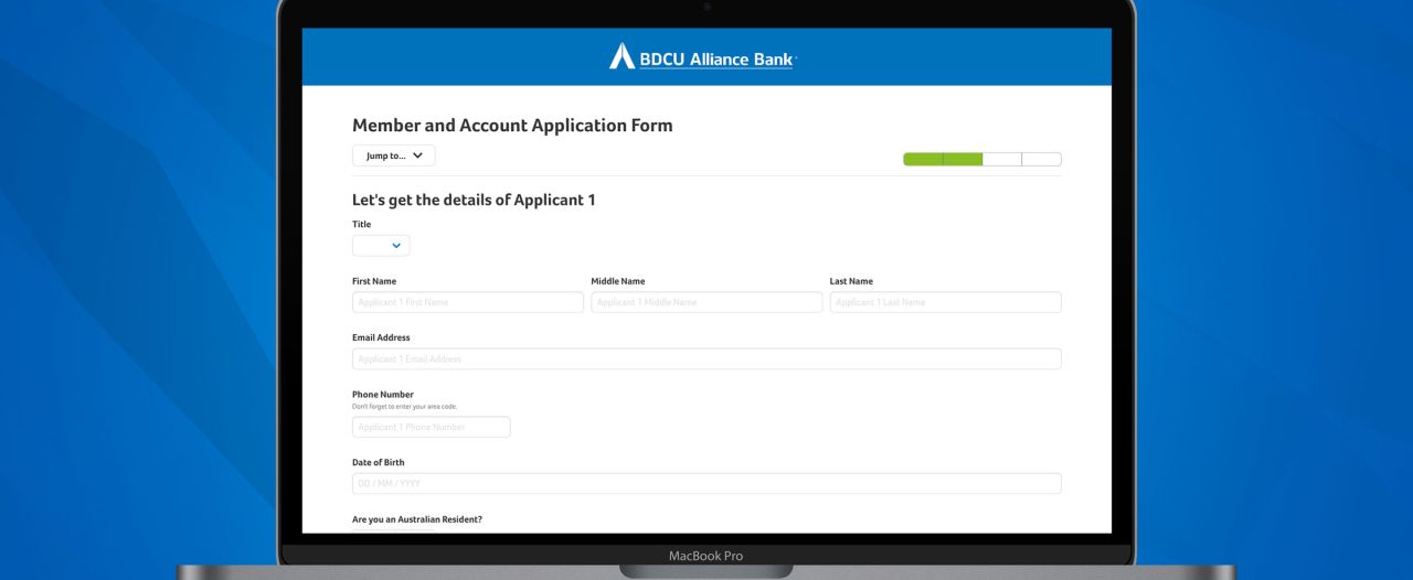
With the increasing importance on customer access to online business systems, we helped AWA Alliance Bank, BDCU Alliance Bank and Circle Alliance Bank develop an online forms system to make it easy for end customers (and potential customers) to access their forms online.
Like all of our custom web development projects, the online form system is also responsive, allowing users to access and complete forms from their mobile phone or tablet, as well as their traditional laptop or desktop computer.
At the end of the day, we’re all about making things easier - and in this case, easier for the Alliance banks to collect data, and easier for users to enter their information.
More than just a form
But forms are everywhere, and are so simple. Why do you need a whole system just for forms?
Good question: but these forms are more than just a contact form.
In the equivalent printed formats, these forms can be up to 8 pages in length, and may require some time and effort to complete them. They can be broken up in to different sections, with a range of different data types, and are uniquely customised for the Alliance Banks data collection processes.
Given the length of the forms, the online form system allows users to save their progress, and come back to resume it later - especially handy if you’re asked a question you don’t have an immediate answer to a specific question.
With these longer forms, we were able to divide them up in to more digestible sections, showing a smaller number of form components on a single page. We still did make it easy for users to navigate to different sections of the form, and save in the background too. This has given us the control to ensure each form is uniquely handling the specific data collection needs of each bank - and this includes the specific page layouts and order/sequence of data collection.
Entry made for the user... and the Alliance team
To help keep entered information clean and structured, the online form system displays different fields to complete based on the information required.
This can include:
Plain text fields
Longer multi-line text fields
Email address
Checkboxes (select many)
Radio options (select one)
Select box
Repeating blocks of fields
File uploads
Numbers and Currency (for dollar values)
Sliders
Along with these field types, the system also features validation against entered information, ensuring that all required information is completed, and that the details provided match specific content types. For example, a currency field needs to be a number up to two decimal places.
There are even specific use cases that display realtime summaries to the user - for example, when entering their expenses, section by section, line by line, the user is shown a monthly total that updates with each data change. Not only does this mean the Alliance team need not manually add up their expenses, but also educates the user on what their monthly expenses are.
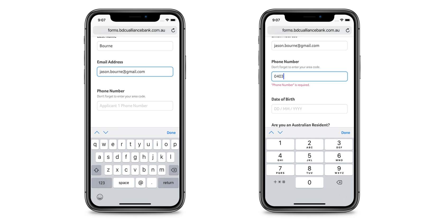
On mobile devices, where virtual keyboards are displayed, the system also adjusts the displayed keyboard based on the field type. If the user is entering a phone number, the keyboard displayed is designed for numerical data entry. Similarly, if the user is entering an email address, the keyboard displayed is optimised for email address entry, with easy access to the @ symbol. These virtual keyboards have no impact on desktop users, but do make the data entry process easier for those on mobiles and tablets, including both iOS and Android.

While on a mobile too, all form fields still work with touch input - sliders, selects, checkboxes, and even file uploads, allowing users to take a photo on their device (or use a saved file) and upload that to the system. We have worked hard to remove barriers from users being able to easily and effortlessly complete the forms.
Speaking of phone numbers, the forms system also handles the formatting of phone numbers. This is such a valuable tool to ensure:
Phone numbers are valid, and
Phone numbers are displayed in a consistent and easy-to-read manner
Users and the Alliance Bank team see these phone numbers in standard formats - a mobile number, for example, is chunked in to 04XX XXX XXX. Not only does this make the number easier to read for the admin team at the Alliance Banks, but also ensures phone numbers are displayed in the same consistent way. This extends to landline numbers, as well as special numbers such as 18, 13 and 19 numbers, each with their own standardised format.

There are sections of the forms that depend on previously entered data - this ranges from whether the user needs to fill out a single field, a number of fields, or even an entire page of fields. This means that as the user is entering their data, the later parts of the form are updating to only be asking the questions that are actually relevant. For example, if a user has answered that they are applying for a credit card, questions relating to a home loan product are hidden. This keeps the user’s focus on just the fields they need to see, and these rules are built case-by-case to meet the unique data collection needs of the Alliance banks.
The large range of custom and personalised data entry fields makes it easier for users to provide the valid and correct data, with effortless ease, and allow the Alliance team to view their information in standardised ways, making it an easier process for every single user of the system, be that an Alliance employee or a user filling out the form. Remember, we’re all about making it easier, and this gives the online form system a massive tick.
Centralised administration for the Alliance teams
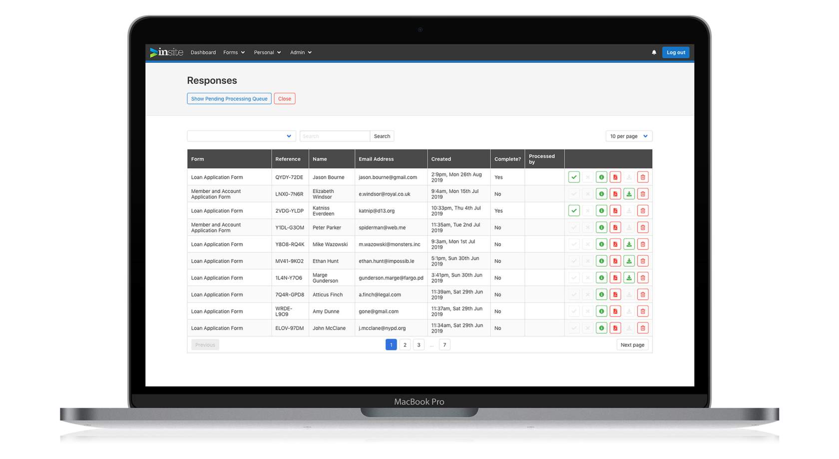
With the front end carefully crafted to make it easy for users to fill out forms, we also worked hard to develop an administration area to allow the Alliance Bank team to view and manage form data.
The admin area has been built on our next-gen version of our inSite framework, delivering a fully responsive, lightweight and high-performing interface and user experience.

Each user to the backend has their own set of access rights - meaning that some users just get access to the form data for day-to-day processing, where as others have greater access to allow for the management of users and even the management of form details.
This means that each administrator can have their own password - definitely no sharing of passwords here - and when they action a form (to mark it as "processed"), the data correctly lists who did the processing. If that administrator leaves the bank, then their user account can be easily and promptly deleted, removing their access, without impacting access for other users or needing the entire team to remember a new "global" password. Every administrator needs their own account. Always. It’s such a good practice for any system to follow.
When viewing completed form data, the system then handles and generates on-the-fly PDF files in a standard format for each bank that focuses on a neat and readable layout, and includes customer-signable components for when the paperwork is presented to the customer, including full privacy and terms and conditions content.
This means that when a user completes a form, the administrator can then prepare a PDF, print it, and have final documentation ready to go for user signatures with just a single click. Not only does the forms system make it easy for users, but also the administration team.
Each form does include its own PDF layout, meaning that the Alliance banks are not railroaded in to one specific format - each form, being hand-crafted itself, is able to have its own hand-crafted PDF export that works for the types of data (and all of those conditionals and formatting helpers we talked about earlier) in a simple, consistent and administrator-friendly layout.
Looking to the future: extending the Alliance forms system
Now that the forms system is live, it is not finished yet. Yes, it works, it is being used every day by new customers (and the bank administration team), but it is never really finished. This development project has created a broad, flexible and future-ready foundation for the banks' forms system: a foundation that is just the start of future growth.
If a new field needs to be added to an existing form - no worries, we can easily update the form to allow for a new piece of information to be collected, and also displayed in the rendered PDF.
If a whole new form needs to be created - great, the forms system has been designed to make it possible to add new forms to the system without impacting existing form behaviour, and the interface designed to handle a growing number of forms.
While planning the build for this system, we considered the changing nature of the forms and the needs of the banks, and ensured that the foundation built gives us, as the developers, a great platform to easily work on without creating technical stresses.
At Mity, we do love to create quality long-lasting and on-going relationships with our customers - and continuing to evolve the features of the form system is possible through the implementation of the flexible form layouts, powerful field types and conditionals, and solid PDF rendering. Not only will this keep the Alliance banks happy, knowing their investment can continue to evolve as their needs evolve too, but also keeps our developers happy, working on a code base that is smart, modern and extensible.

Marty Friedel
Marty has a background in Computer and Information Science, software development, web development, multimedia and web accessibility, and is Mity Digital’s resident nerd.
Outside of his programming work, Marty is a keen landscape photographer, and also teaches Les Mills group fitness classes.

