Testing your website during its development is key, but your website shouldn’t only be tested in development, and testing isn’t just about "does it work".
Surprisingly, usability is one of the areas of testing that is either glanced over or not done at all, but is probably the one of the most important things to test - if someone can’t use your website then they can’t buy your product, find what you do or how to contact you.
The most common area where I see issues with usability is on mobile and tablet devices, which is how many of your visitors are accessing your site.
The Sticky Menu
Take the simple usability feature of the "sticky menu". This is when the menu bar of your website "sticks" to the top of the page as you scroll making it easy for people to navigate around your site no matter where on the page they are.
Good web design has this as standard and should be on all sites, but it’s not always implemented well.
All too often while on the couch at night surfing the net on my iPad I come across a website with a poor "sticky menu" implementation, and it really can impede the usability.
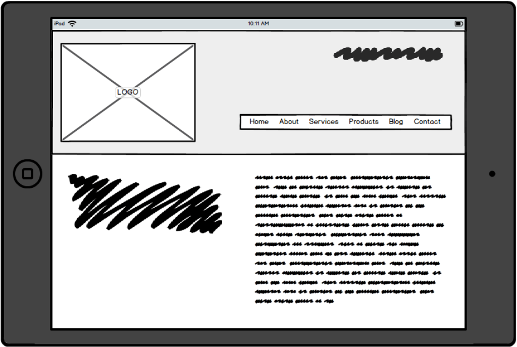
Poor implementation

See how the header takes up 1/3 of the screen space available. This doesn’t provide much space to show the most important part of the page - the content, providing the user with a poor experience and making reading content more difficult.
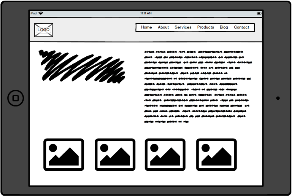
Good implementation

By implementing a sticky menu correctly, you can see how the header takes up much less space and allows for more content to be visible. This is achieved by shrinking down the logo, reducing spacing and in some cases removing unnecessary elements from the header. Remember the "slim" version is only shown as you scroll down the page - once you’re back at the top the full header is displayed.
Other Tips
Your website isn’t a set and forget kind of thing - it needs constant love, attention and maintenance - just like your house or car does.
Here is a list of some other things to check on a regular basis:
Contact form - this is often something that goes wrong so it's important to test your contact form regularly if you don't seem to be receiving enquiries. Often these emails also get stuck in SPAM so make sure you check there too.
Broken links - check your site for links that are broken. If you have removed a page make sure you update or remove any links to it. Broken links result in 404 (page not found) errors and they are annoying to users and Google doesn't like them.
Content - review your content regularly and make sure it is up to date. Are your contact details still correct? Do you still offer that service or sell that product? When was your last blog post?
Checkout process - if you have an online store you should order from your site to see what the customer sees and make sure it is working as expected.
Making the review and testing of your website part of your weekly or monthly schedule will ensure you pick up, and address, any issue and keep your site looking and functioning at its best.

Michael Scruse
Michael brings a rare blend of technical, web and sales expertise to every project, backed by over 30 years of experience in the IT industry.
He’s also a qualified chef, though these days his culinary skills are mostly reserved for the home kitchen. A self-confessed history buff, Michael is currently deep into researching his own family tree.


