But let's make sure your site's photography is saying the right thousand words.
Choosing the right photos for your website is crucial - and goes beyond just taking a photo and whacking it up. Your site’s photography needs to fit within the design and overall aesthetic, match the values of your brand, and say the right words to your customers.
Are they the right shape?
Just because you have a gorgeous photo doesn’t mean it is right for your website.
Let’s say your website has a wide almost "panoramic" banner image. 99.99% of the time, your image will need to be cropped - that is, parts of the image will need to be removed so that your image can fit the space nicely.
And you have fallen in love with one of your new photos. But, wait, that photo is in a "portrait" aspect - and the website image needs to be a "landscape" aspect. OK, so let’s look at cropping... in to Photoshop we go, and with our crop tool, can set the aspect for our panoramic banner image.
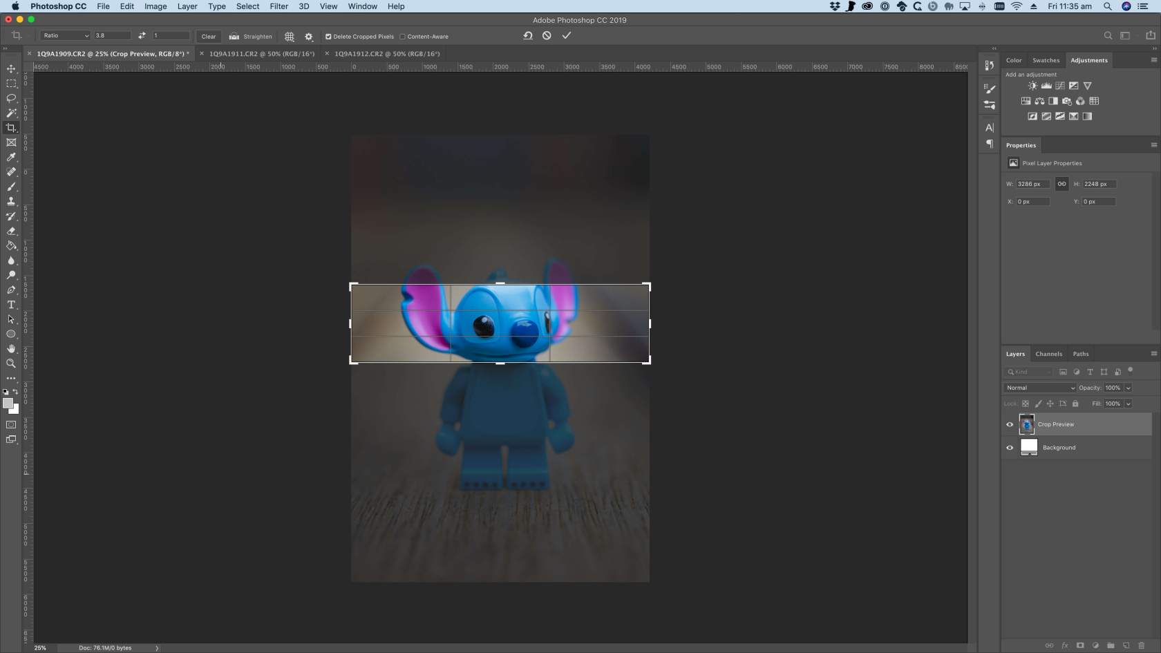
OK so that’s not too good. Look at how much of the image we’re going to lose. The image needs to be wider than taller - so it’s best to use a landscape aspect image first. Let’s try this with another image, this time one in a landscape aspect.
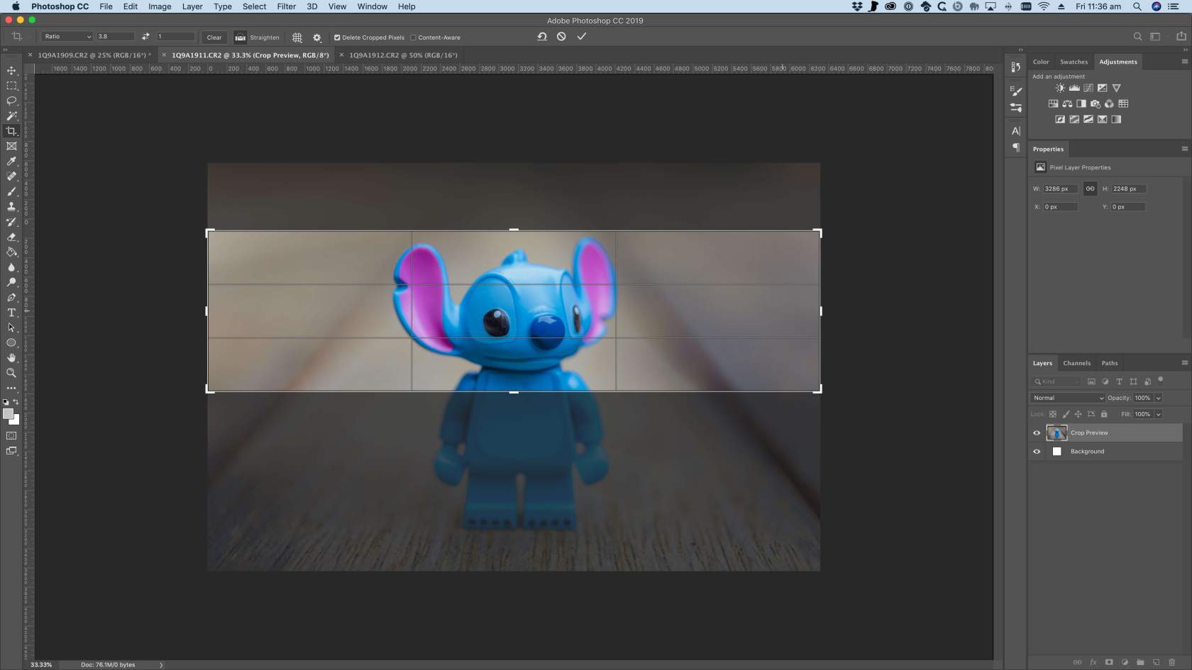
So that’s better, but we can still really only see Stitch’s face. I’d really love for his whole body to be visible.
But this often means that photos for websites - especially ultra panoramic images like banners - need to be considered when actually shooting the image.
It’s a good thing we also took an image from a distance that has more space to crop. Let’s try one more time with a third image.
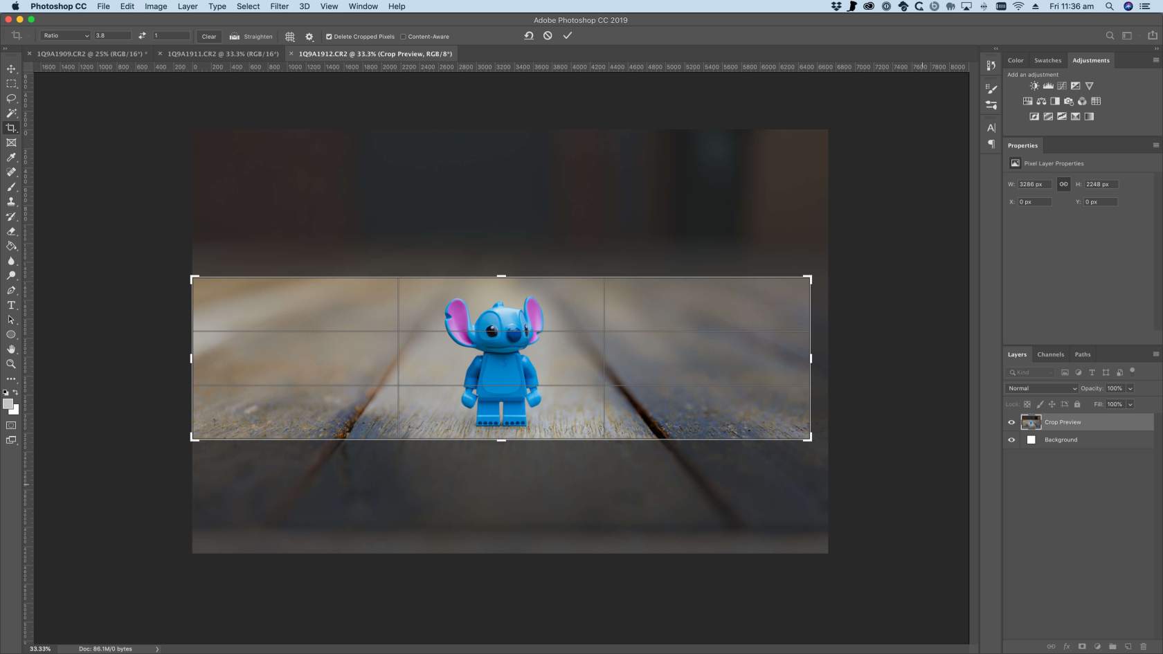
Much better - we can now see the entire Stitch (woo) and the edges, which often will get cut off on smaller devices (with good responsive design anyway) are not distracting.
But can you see how a photo doesn’t necessarily fit every hole?
Now imaging your website is selling Stitch - after all, who wouldn’t want to buy him - the first two photos we tried above are better suited to a feature product image - which typically fits in a more regular shape, and not ultra-wide. The first two photos still have use - but they just need to be used in the right space - and this could even be on social media too.
Are they high quality?
If a picture says a thousand words, and your imagery was shot on a low-quality mobile device, with bad lighting, doesn't feature your "subject" and is overly compressed, what does your image really say to your customers?
It says that you don’t value your own brand and your own product, and that your product (or service) isn’t quality, and isn’t worth your time to actually show off professionally.
And that’s not even a thousand words.
Before your customer has even read a word on your site, they may already be judging your business based on the quality of your imagery - and if that says the wrong thing, they’ll be gone before even realising how good you actually are.
Does this image (with a highlight on its over-exposure and high compression) make you want to buy Stitch?
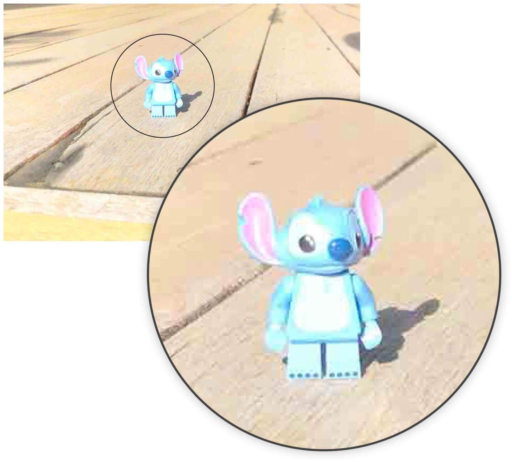
Take the time, effort and care to ensure your imagery is professional and on-brand.
Are they optimised for the web?
So you’ve gone to the (priceless) effort of having great photography for your websites - and even cropped them to fit the right size shape for your site’s design. On a winner so far!
As the final step, it is important to make sure your images are optimised for your website. If your images aren’t optimised, they can chew up your visitor’s data limits, negatively impact your SEO efforts, and make your website feel really slow.
This is a slightly tricker one to balance out, but still worth your time investment. It’s critically important to ensure that your images are balanced in terms of their resolution, dimensions and compression.
Any image for display on your website should be saved with 72 DPI (dots per inch) - the print world loves higher DPI (to help with higher quality printing) but for screens, 72 DPI is all you need.
When compressing to JPG, it is important to play with the best compression for your image. JPG is a lossy compressed format - this means that when an image is exported as a JPG for the web, it has compression applied that will permanently impact the image. If you compress your image too much, it will become blocky (see the bad Stitch image above) - but if you don’t compress your images enough, they’ll be too big to download.
There’s no magic answer for every photo here - you need to balance it out to preserve quality, but also not bloat your file sizes.
With careful optimisation, you can get some incredible looking images with more manageable file sizes.
Slim files, sized for the web, at 72 DPI, efficiently compressed, will help make your website feel snappy, download fast for users (and not chew in to their data limits too much) and help your SEO.
Don’t forget retina (high-dpi) users
This is a bonus one... and more advanced.
Retina (or high dpi) users are those on high resolution screens - such as recent Apple devices and Ultrabooks. They have incredibly fine pixels to help with presenting sharp and clear images.
If your site has a gap for a 200 pixel square image, and you put a 200 pixel image in place, users on retina screens are effectively seeing that image scaled up to the higher resolution. This can lead to a lack of clarity and sharpness, and can show off compression.
Simply exporting the image at 2x (so 400 pixels, square) means that high resolution users see the image without upscaling - so appears sharp and clear.
Quite often, when well optimised and compressed, the difference in file size between the 1x and 2x images can be negligible - so there’s really no downside to serving retina-friendly images - especially when they look so good!
When you're getting your images ready for your website, making sure your photography is designed to fit the space is crucial to ensuring your website, your products and your imagery look their very best.
If you're unsure of what all of the technical stuff means, it's great to have an awesome web dev team who can help out. Did you know we're pretty awesome? You should say hello.

Marty Friedel
Marty has a background in Computer and Information Science, software development, web development, multimedia and web accessibility, and is Mity Digital’s resident nerd.
Outside of his programming work, Marty is a keen landscape photographer, and also teaches Les Mills group fitness classes.

