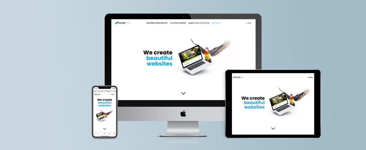
A responsive website is one that is able to adapt and respond to the device that it is being viewed on.
But what does this mean?
To put it simply, your website will take note of the size of the device that it is being browsed on, and style your website to suit that size screen.
So on a small-screened smartphone, buttons will appear bigger, text will be larger and easier-to-read, and the navigation will be modified to suit a touch interface with minimal space.
Meanwhile, on a desktop computer where there is plenty of space, you’ll have a more spacious layout where you can see more of the page on a single screen, with larger images and navigation optimised for a mouse.
One of the key ideas that we work towards with responsive design is delivering all of the information and user experience in a way that is transparent to the end user – your site’s visitors.
This means that your visitors don’t need to zoom in or zoom out on a mobile device, or scroll left to right just to read a single line of text. Your responsive website delivers all of the information, all of the functionality and all of your brand in a single site that responds to your visitor’s device.
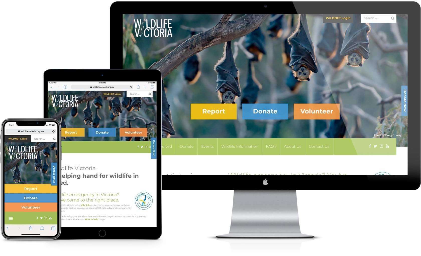
Take a look at our website for Wildlife Victoria.

When Wildlife Victoria update their website, they can make a single change and that is reflected on every device. All of the functionality of their site is available on mobiles, tablets and desktops – including reading all content, watching videos and making donations.
Mity Digital are specialists in developing responsive websites, and can help you reach your audience. Contact us today to find out more.

Marty Friedel
Marty has a background in Computer and Information Science, software development, web development, multimedia and web accessibility, and is Mity Digital’s resident nerd.
Outside of his programming work, Marty is a keen landscape photographer, and also teaches Les Mills group fitness classes.

